
Rebranding Pearson as a global identity
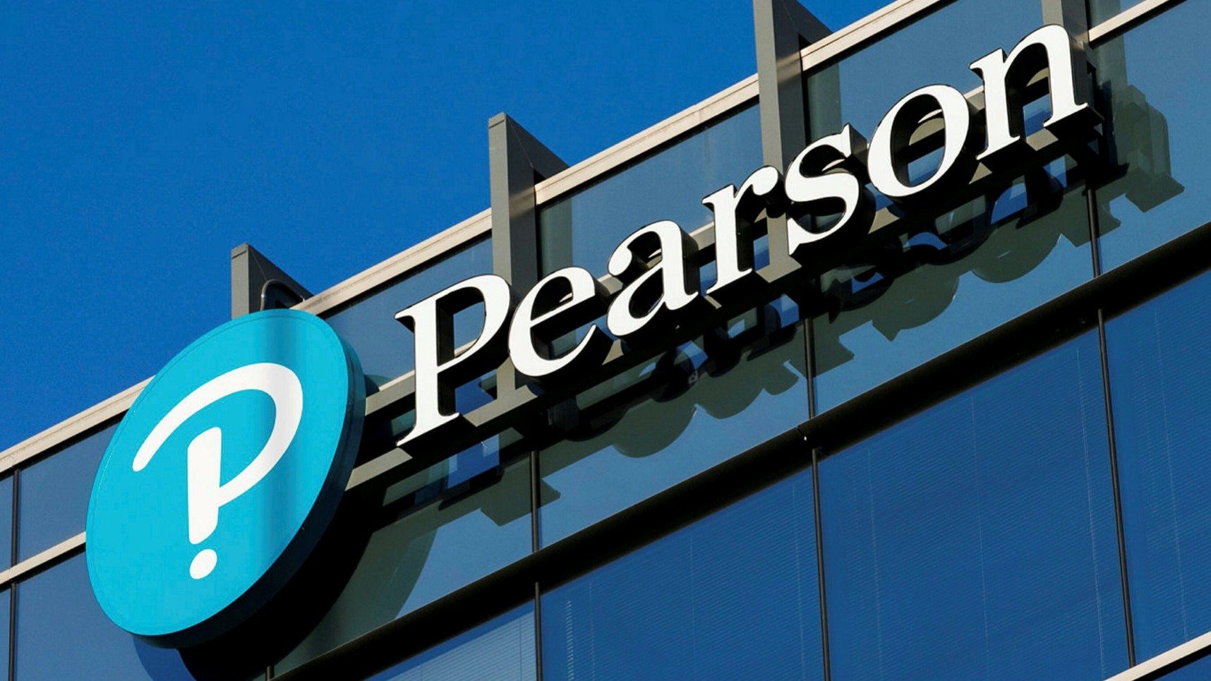
After extensively mapping and building Pearson's internal architecture we went about completely re-branding them, signalling their commitment to being an education company rather than just a book publishers. Their logo and brand needed to come from their goal of empowerment through education. Working from social insight around what education should be like, a combination of excitement and curiosity we created a brand for all ages, and all stages. The Interrobang was chosen, a punctuation mark that combines the question mark and the exclamation mark that embodies the idea of excitedly asking a question, and a thumbprint to house the mark gave it a sense of individuality.
Working with Together Design we created the icon and conceptual approach to the identity, Together Design then took those these and created a unique and beautiful expression for Pearson. Below is the design story combining Freemavens icon and initial concept along with the rollout of assets.


